To begin this project I decided that I would like to create some type of visual piece that advertises my blog “Understanding the Outdoors”. I thought that making some type of graphic that could he put into a magazine, an advertisement spot on a website, or a post on a social media website would be the best option for this.
I would expect this to be in some typos of outdoor magazines or social media pages (hiking, hunting, fishing, camping) where it would be viewed by people who may be interested in these topics but would like to learn more
To make this as appealing to the viewers as possible I wanted to use high quality images of a singular outdoor activity. Combining this with two other images from this activity to take a less prominent role in the graphic. I also wanted to add a short phrase to grab attention and the current logo and title of my blog.
Choosing Images: When deciding on images for this I wanted to keep the natural clean feel of the outdoors in the images. To me this meant somewhere that is as untouched by people as possible, and in its fully natural state. These images needed to be high quality for social media potting, with clear crisp images.
Picture 1:
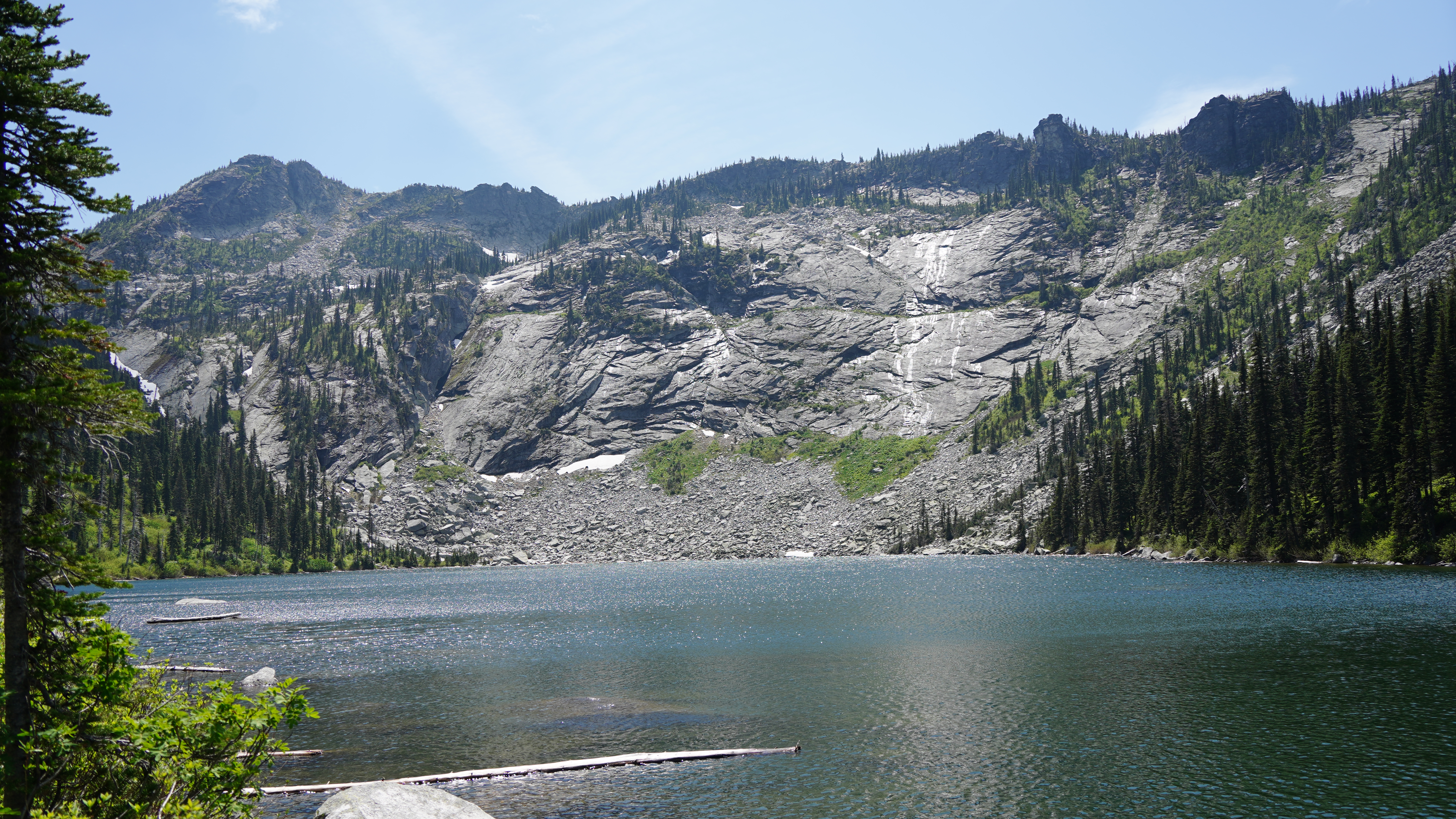
I wanted my first picture to be the main prominent picture that would be displayed in my image, the eye catching image displaying the outdoors and its beauty. Searching for this I came across a hiking trip that my friends and I went on last summer up to an alpine lake in north Idaho. Since I had bought a nice camera the spring before I naturally brought it song and was able to take many pictures song the way that I now was able to use for this project. One of these being the main image that I chose to be the focus of the project. A wide angle video of the lake we had hiked into, with not human touch in sight over the large expanse, with an colors of blues, greens, and whites making the image seem even more natural and outdoorsy. Combine with a crystal clear image showing the beauty of this location I thought it would be perfect for this design

Picture 2:
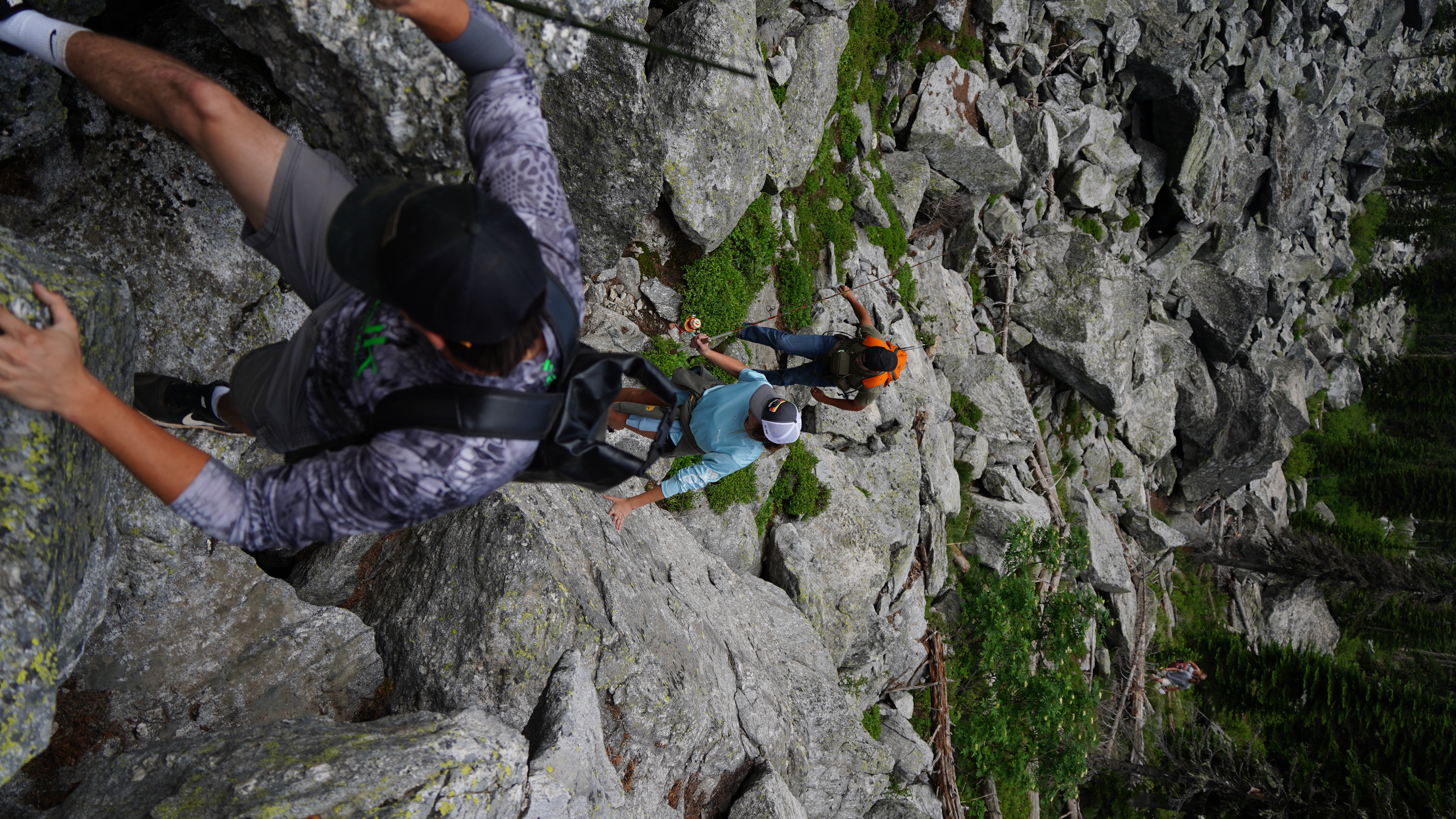
I chose picture two too provide a role of movement in this graphic to make it more interesting and eye catching. For this I chose the image of the group of us climbing up through rock fields on the way to the lake to satisfy this role in the graphic.

Picture 3:
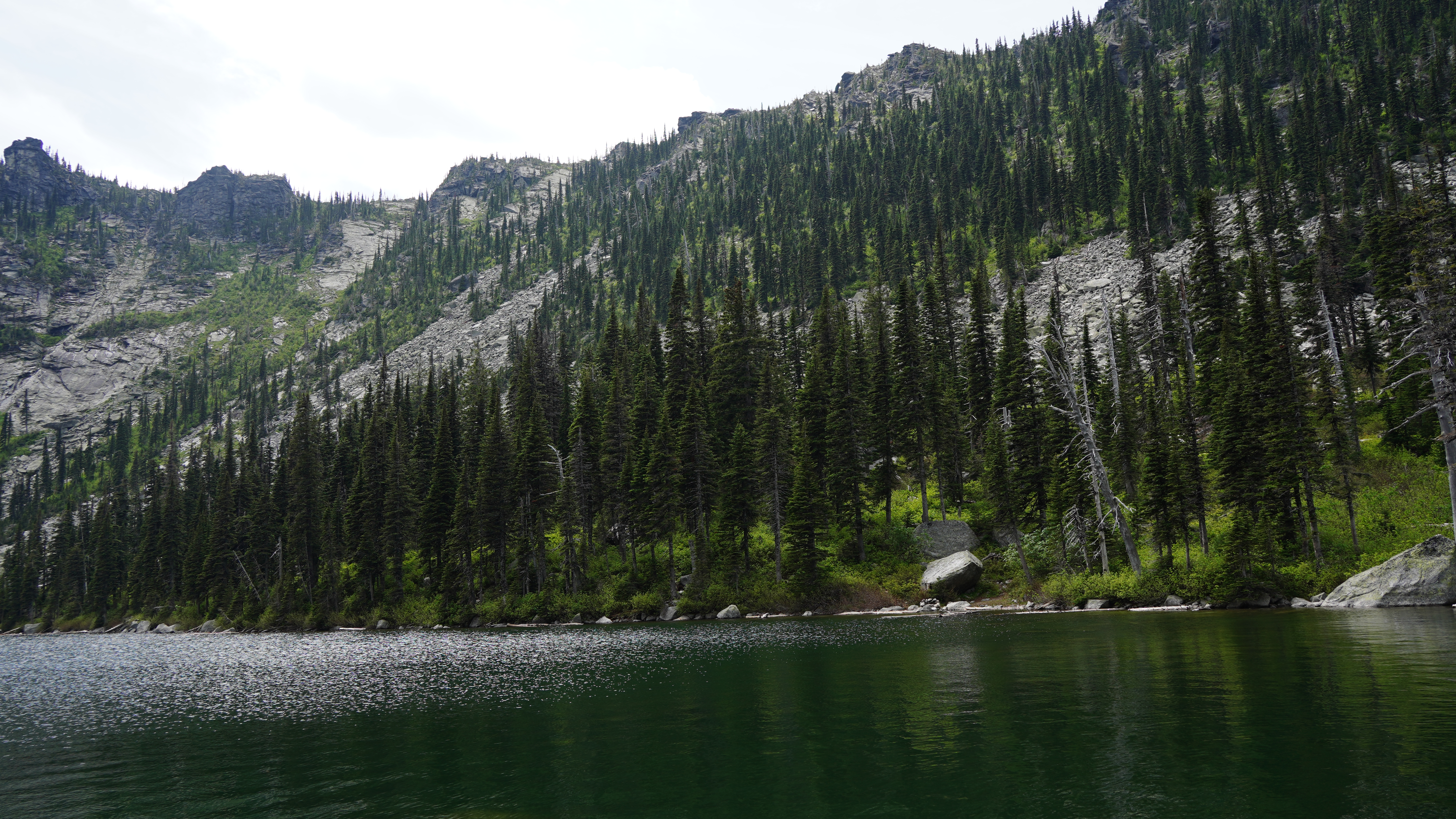
Picture 3 I wanted to use as the background, this image would not be prominent in the graphic but more of a piece to tire it all together. The challenge with this is finding an image that will not make the graphic too messy because there is now too much going on. Because of this I chose a pretty subtitle image that could have pictures and words put over the top of and still serve its role. With no specific image in the picture that would draw attention away from the pictures I was hoping to draw attention towards (pictures 1+2).

Layout: I think the layout of this graphic is very important to how it is interpreted. For me I thought that it was most important to keep the layout simple and clean for a graphic like this, I had high quality images that are showing what I want, and did not want to take away quality by doing something with them that would take that away. Also keeping with the natural outdoor theme I think it is is best to keep the editing to a minimum and let the pictures show off what there is to see. To do this I first chose “Picture 3” as my background and base to this design. Now with making this my background image and not wanting it to be the focus of attention I wanted to tone it down. For this I added a white layer over the image and changed the opacity until I liked the degree of faded the image now displayed.
Next I added “Picture 2”, this image would be displayed on-top of the background, but not the center of attention. This being a pretty bight image with good color I decided that I also wanted this image to be faded a bit and added a white layer again. Changing the opacity until it was just barely noticeable. Just enough to not draw attention directly to it. And the after I added “Picture 3”, with no white layers it hide this image I put it on top of everything drawing all the attention as soon as it was seen. To make these top two images stand out I also added small thin black borders around them to make them pop and not be blended with the background colors at all. Lastly I added my current logo for my blog and the blog name in the bottom left, and added the words “Go explore the outdoors” in the image too for an encouraging message for the viewers.
Overall I think my graphic design turned out pretty well. I think it did a good job of conveying the message that I was hoping to get through to the viewer, while also providing a source of advertisement for my blog and text to reinforce the message and add to the theme of the project.
